design is effortless

RSA HorizonED

a classroom observation web-app for school admins

In progress

Radiant STEM Academy’s admins wanted an app to simplify their classroom observations. I designed RSA HorizonED so admins can observe, give feedback, and look back on past visits in one simple web-app.
Faatimah’s signature

Individual Contribution

Researched, designed, and tested.

Project Tools

Figma, Claude Code, Adobe Illustrator, Phoenix Code, Zoom

Project Duration

Design sprint · in progress

01.

Overview

The private STEM school Radiant STEM Academy had a team of admins who wished for an app for their classroom observations.

RSA admins

Requirements they wanted RSA admins

  • Admin log in
  • Teacher selection by name
  • Classroom observations
  • The school’s existing checklist and rating system
  • Written feedback
  • Emailing observations to teachers
  • Observation history
  • Draft saving
Faatimah Gamble • UX / UI Designer & Researcher

How I planned on doing this me, designer

  • A profile for every admin, so their drafts and observation history follow them.
  • A sidebar that keeps Teachers and Feedback one click away from any screen.
  • Feedback that leaves in one step, emailed straight to the teacher or downloaded as a .pdf.
02.

Research + Wireframes

This was a design sprint, as they wanted the web-app ASAP.

I planned to do my own rapid research, wireframes, and prototype screens in Figma.

Rapid research on apps like Canvas and Workday gave me insight on necessary features to organize lots of people.

Wireframe testing rounded out the research for all screens and admin expectations.

I started each session with ‘You just clicked Teachers. What do you expect to see?’

A. Teachers’ names.

Q. What else?

A. Their grades or subjects, right below their name.

A. A filter at the top somewhere.

Q. Where would you add a new teacher?

A. At the top, next to Teachers.

Q. What should the three call-outs say?

A. How many teachers I have, and who needs a follow-up.

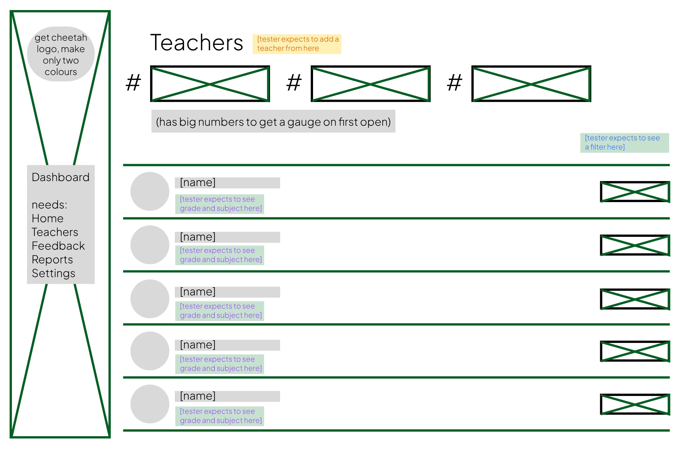
The Teachers wireframe: a sidebar, three number placeholders under the title, a list of teacher rows, and notes on where testers expected to add a teacher, see a filter, and see grade and subject.
03.

Reducing Perceived Effort

Making the app feel effortless.

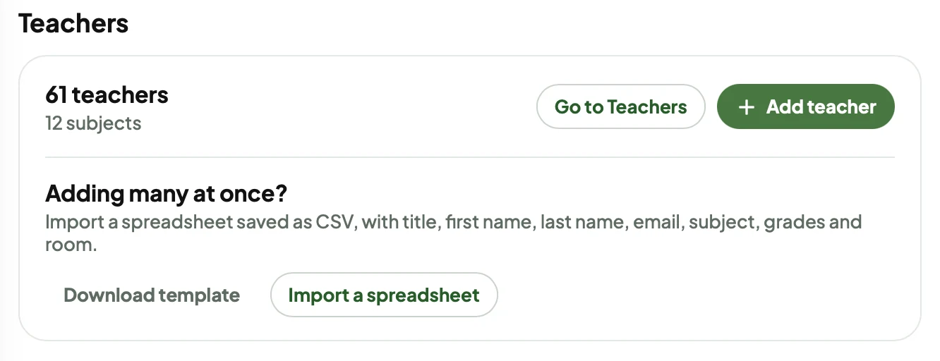
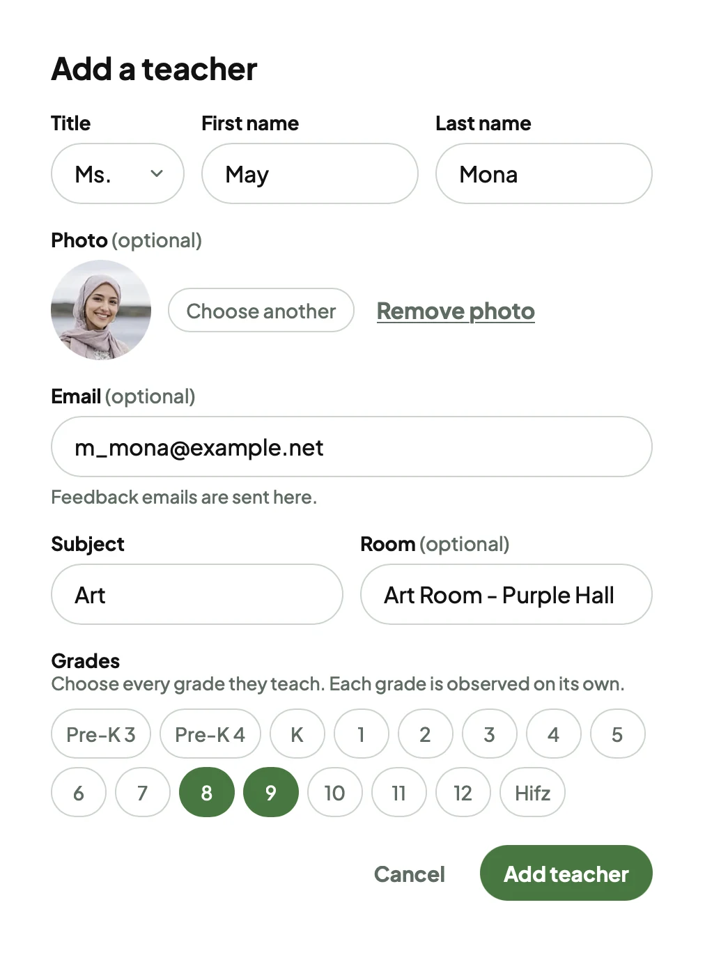
Admins can add teachers one at a time, or import a spreadsheet saved as CSV, with title, first name, last name, email, subject, grades and room.

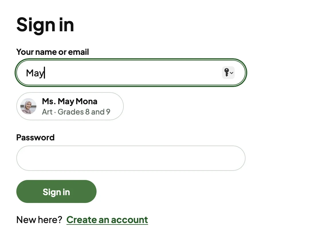
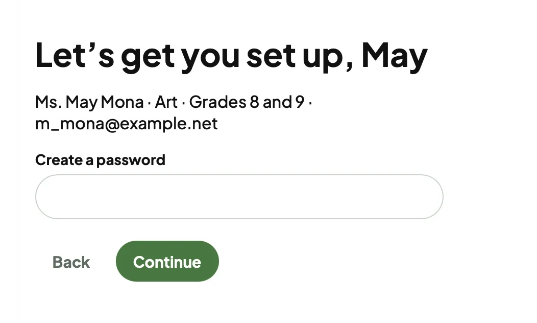
When that teacher signs in for the first time, they show up as they type, and all they do is create a password.

  1. admin adds a teacher
  2. teacher types their name
  3. creates a password
  4. lands on their profile

Add many at once from a spreadsheet.

Before

  1. complete form
  2. write feedback
  3. highlight glows and grows
  4. save
  5. download .pdf
  6. open email
  7. fill in the teacher’s details
  8. attach .pdf
  9. copy feedback
  10. paste feedback
  11. send

My prototype

  1. complete form, glows and grows pre-picked
  2. add feedback if needed
  3. complete and email

It opens the admin’s default mail app with the teacher, subject, and feedback already filled in. No mail app? One click copies it all, or downloads the .pdf.

The goal

I looked into sending through a service like Resend, so in a later version, finishing an observation sends a branded email to the teacher automatically.

To: Faisal Idrisi

Subject: Classroom observation, Visit 4

Hi Faisal,

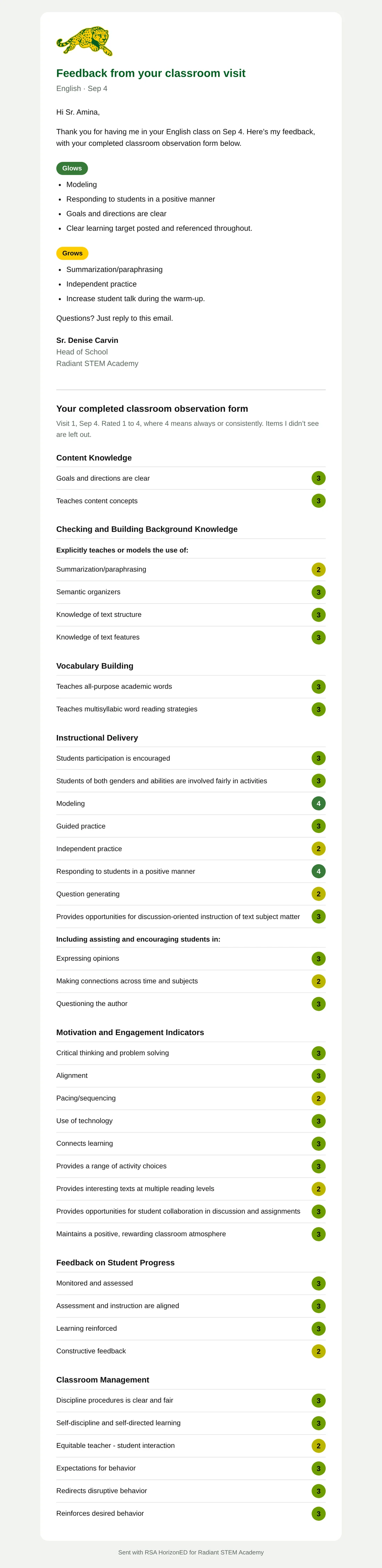
Thank you for having me in your Computer science class in Room 199 on Oct 9 for Ecosystems. Here’s my feedback, with your completed classroom observation form below.

Glows
- Provides the students with explicit instruction
- Teaches content concepts
- Summarization/paraphrasing

Grows
- Knowledge of text structure
- Knowledge of text features

Questions? Just reply to this email.

Sr. Denise Carvin

THE FULL FORM
Rated 1 to 4, where 4 means Always / Consistently (95% to 100%). Blank means not observed.

CONTENT KNOWLEDGE
3  Provides the students with explicit instruction
-  Goals and directions are clear (not observed)
-  Teaches content facts (not observed)
3  Teaches content concepts

CHECKING AND BUILDING BACKGROUND KNOWLEDGE
Explicitly teaches or models the use of:
3  Summarization/paraphrasing
3  Semantic organizers
2  Knowledge of text structure
2  Knowledge of text features
2  Making inferences
-  Teaches comprehension monitoring (not observed)

VOCABULARY BUILDING
-  Teaches domain-specific vocabulary (not observed)
2  Teaches all-purpose academic words
3  Teaches multisyllabic word reading strategies
Notes and reflections: The anchor chart from last week was referenced twice.

INSTRUCTIONAL DELIVERY
3  Students participation is encouraged
-  Students of both genders and abilities are involved fairly in activities (not observed)
2  Modeling
2  Guided practice
3  Independent practice
2  Responding to students in a positive manner
3  Question generating
3  Provides opportunities for discussion-oriented instruction of text subject matter

MOTIVATION AND ENGAGEMENT INDICATORS
2  Critical thinking and problem solving
3  Alignment
-  Pacing/sequencing (not observed)
3  Use of technology
3  Connects learning
2  Provides a range of activity choices

FEEDBACK ON STUDENT PROGRESS
2  Monitored and assessed
3  Learning reinforced
3  Constructive feedback
Notes and reflections: Students moved into groups quickly; the timer on the board helped.

CLASSROOM MANAGEMENT
2  Discipline procedures is clear and fair
3  Expectations for behavior
3  Reinforces desired behavior
2  Manages time and materials

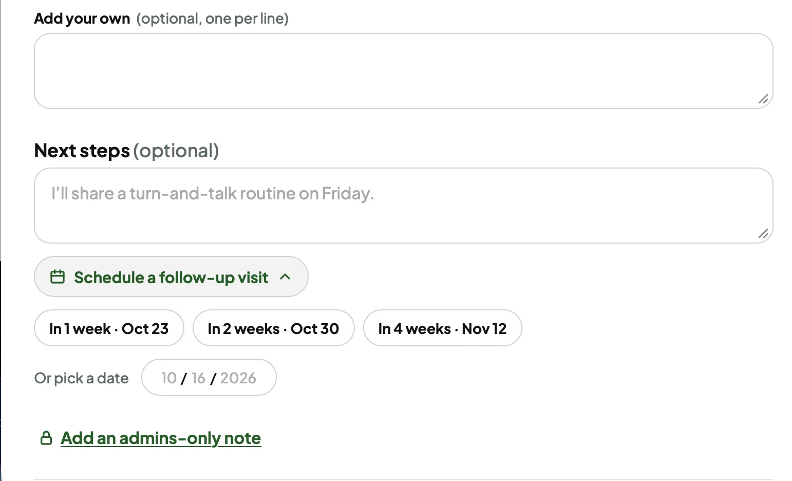
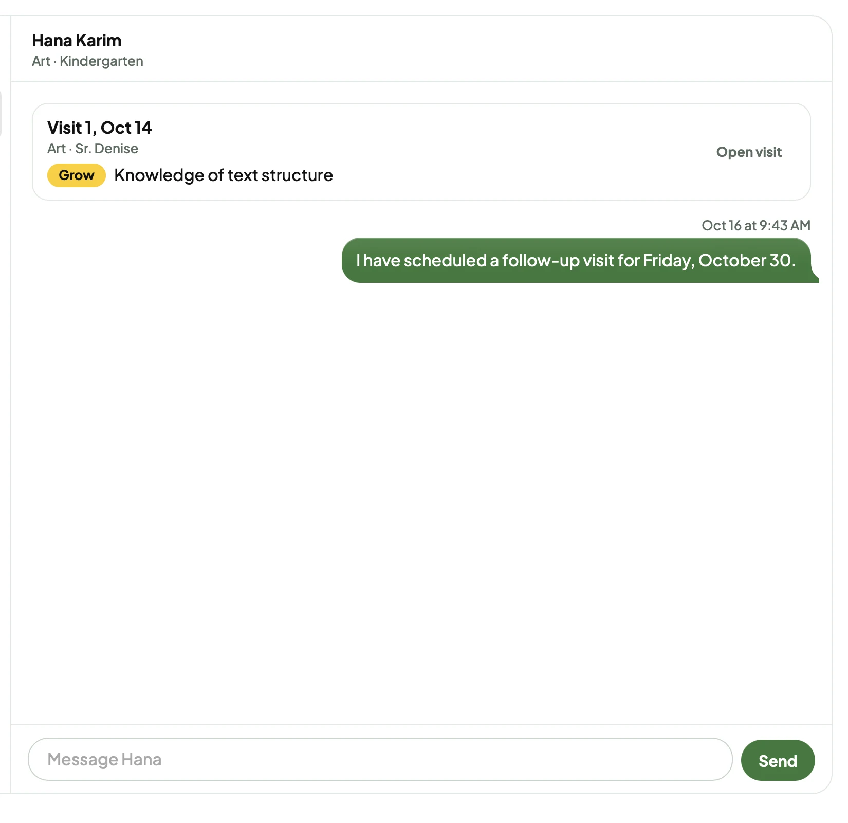
When you finish writing feedback, you can schedule a follow-up right there, in two clicks.

  1. finish feedback
  2. schedule a follow-up
  3. pick a date

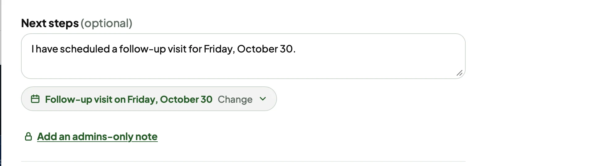
Once it’s scheduled, it

  • Adds the follow-up to the line you close the email with.
  • Sends a message to the teacher’s inbox in the app.
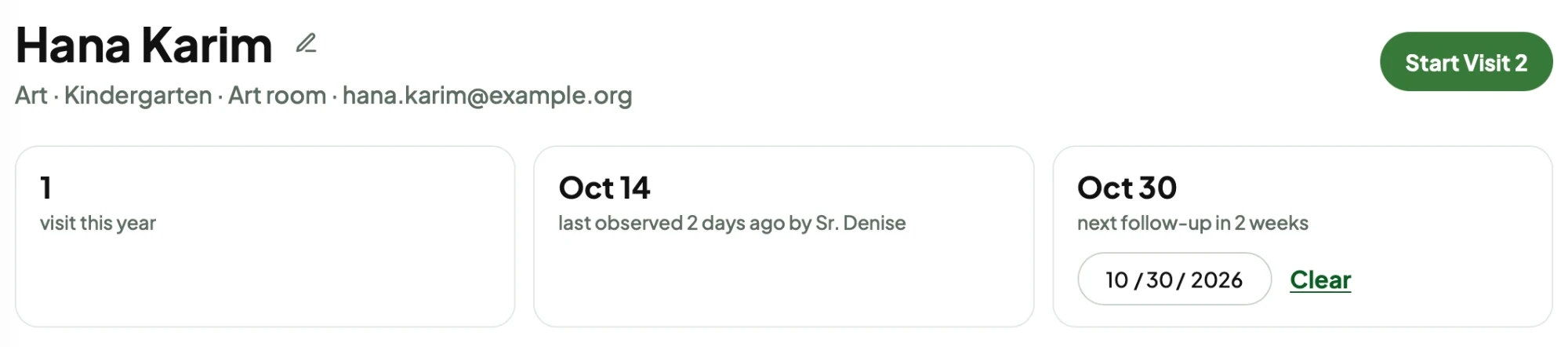
  • Shows up on the teacher’s profile.
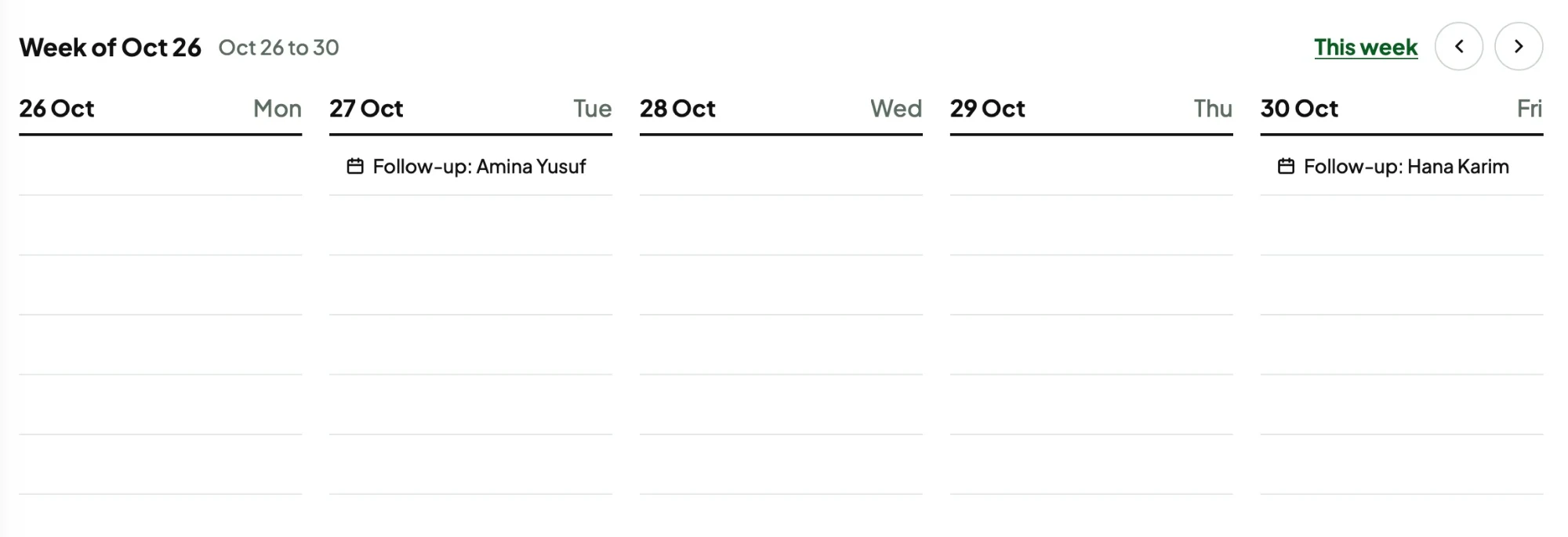
  • Syncs to your calendar.

Schedule a follow-up visit, right under the feedback.

04.

Dashboard + Settings

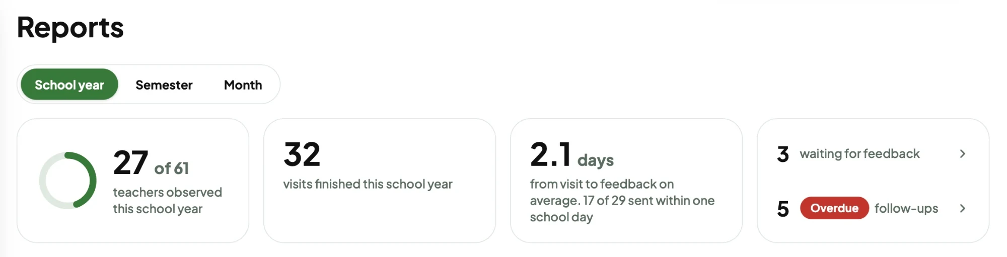
The dashboard gives you a glance of the school as a whole.

Dashboard

Reports: 27 of 61 teachers observed this school year, 32 visits finished, 2.1 days from visit to feedback on average, and 3 waiting for feedback with 5 overdue follow-ups.

Some super simple graphs for the school’s top areas of glows and grows. The school was really focused on getting feedback from walkthroughs emailed out in under a day, so I added that metric as well. Whenever feedback is marked as done, it counts as completed.

Settings

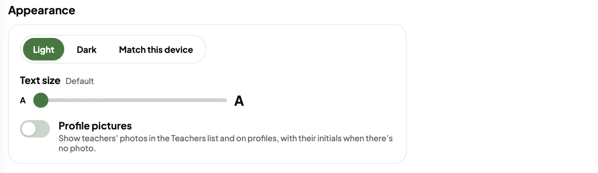
Appearance settings: light, dark, or match this device, a text size slider, and a toggle for profile pictures.
  • Edit and delete teachers.
  • Light, dark, or match this device, plus a text size slider.
  • A second checklist the admins use, and a way to edit the questionnaire in case it ever changes.
05.

Interaction Design

Features from the prototype.

Teachers at a glance

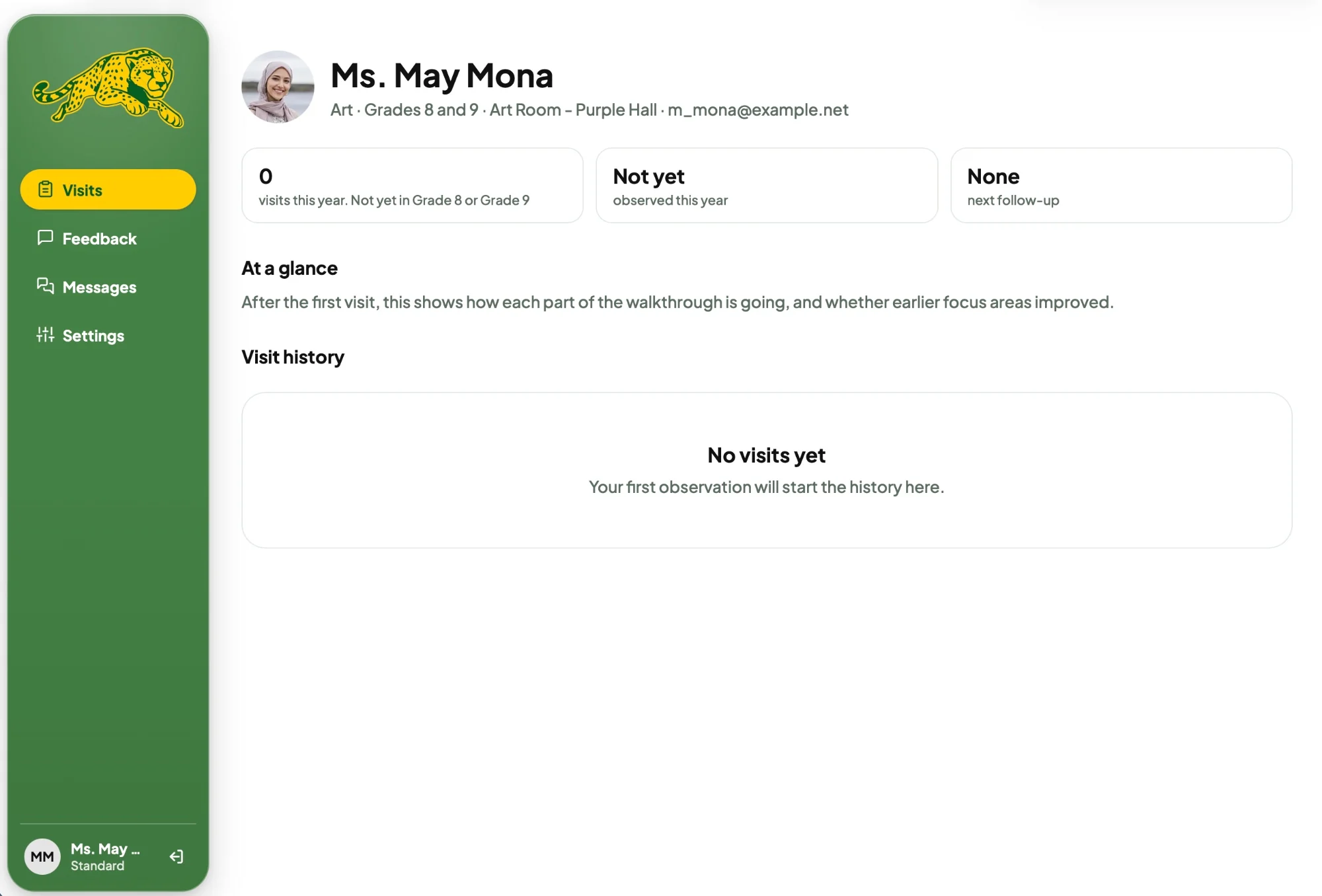
The pills at the top of the Teachers page are a summary and a filter in one.

Click a pill to filter the listTap a pill to filter the list

The sidebar

The sidebar buttons grow on hover.

Hover over the sidebar, or tap a page on the phoneTap a page in the tab bar

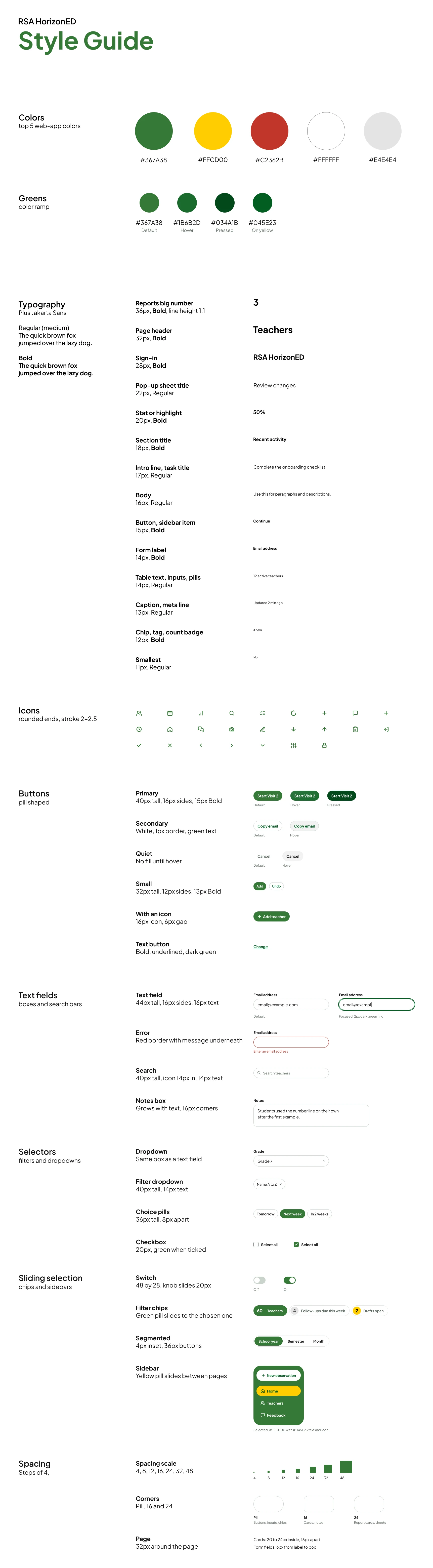
See the full HorizonED style guide The RSA HorizonED style guide. Colors: green #367A38, yellow #FFCD00, red #C2362B, white and light gray #E4E4E4, with a green ramp for default, hover, pressed and on yellow. Typography in Plus Jakarta Sans. Rounded icons. Pill buttons in primary, secondary, quiet, small, with an icon and text styles. Text fields, search, notes, dropdowns, filters, choice pills, checkboxes, switches, filter chips, a segmented control and the sidebar with its yellow pill. A spacing scale of 4, 8, 12, 16, 24, 32 and 48, corners of pill, 16 and 24, and page padding.

Tap the guide to open it full size.

06.

User Testing + Iterations

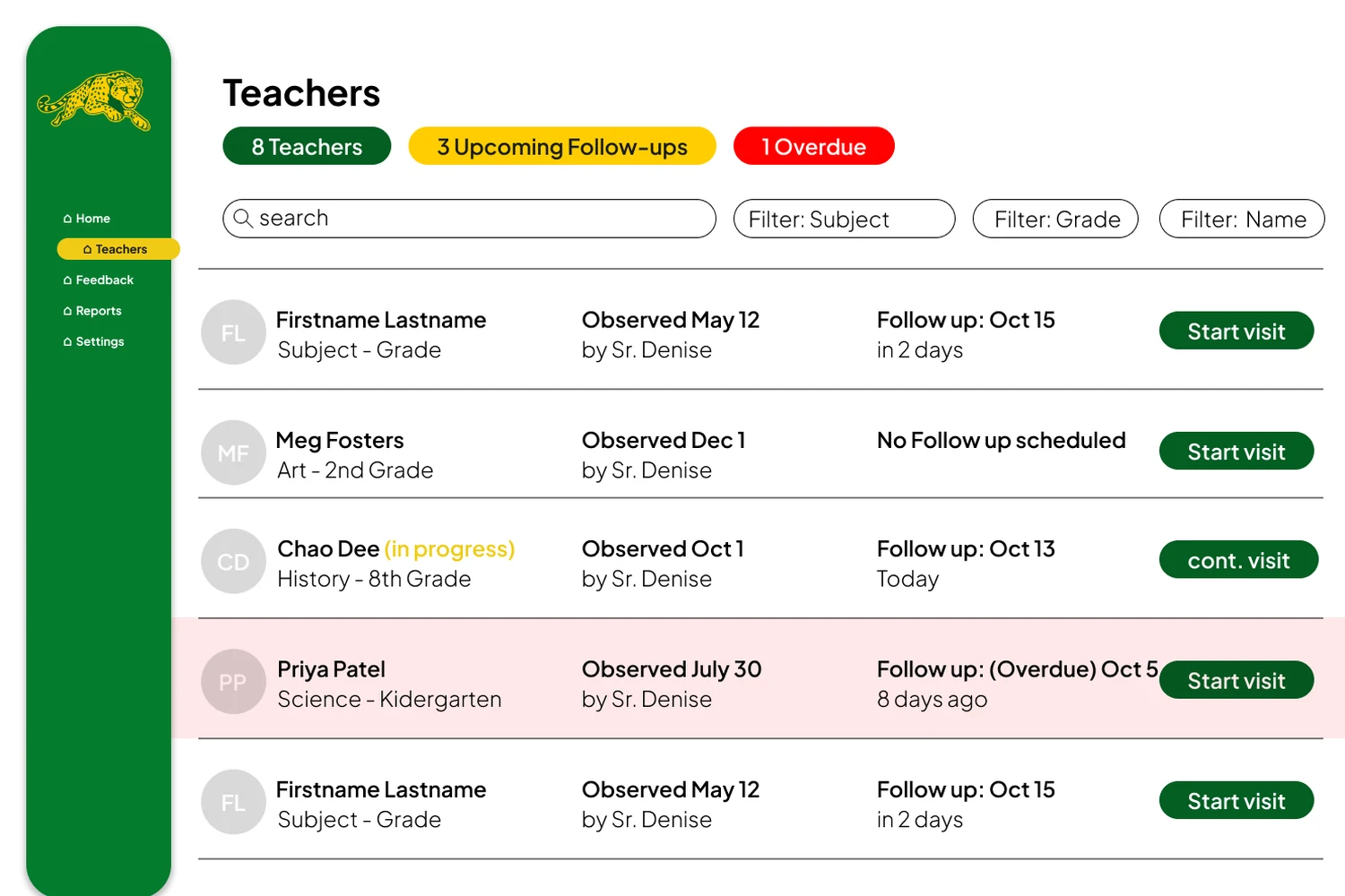
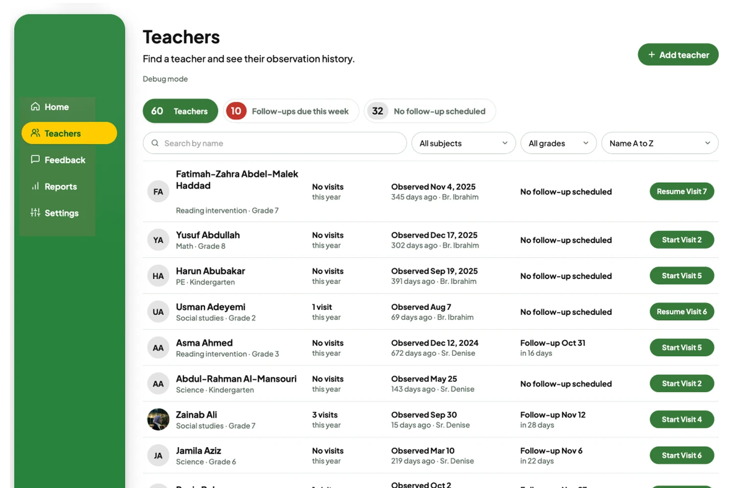
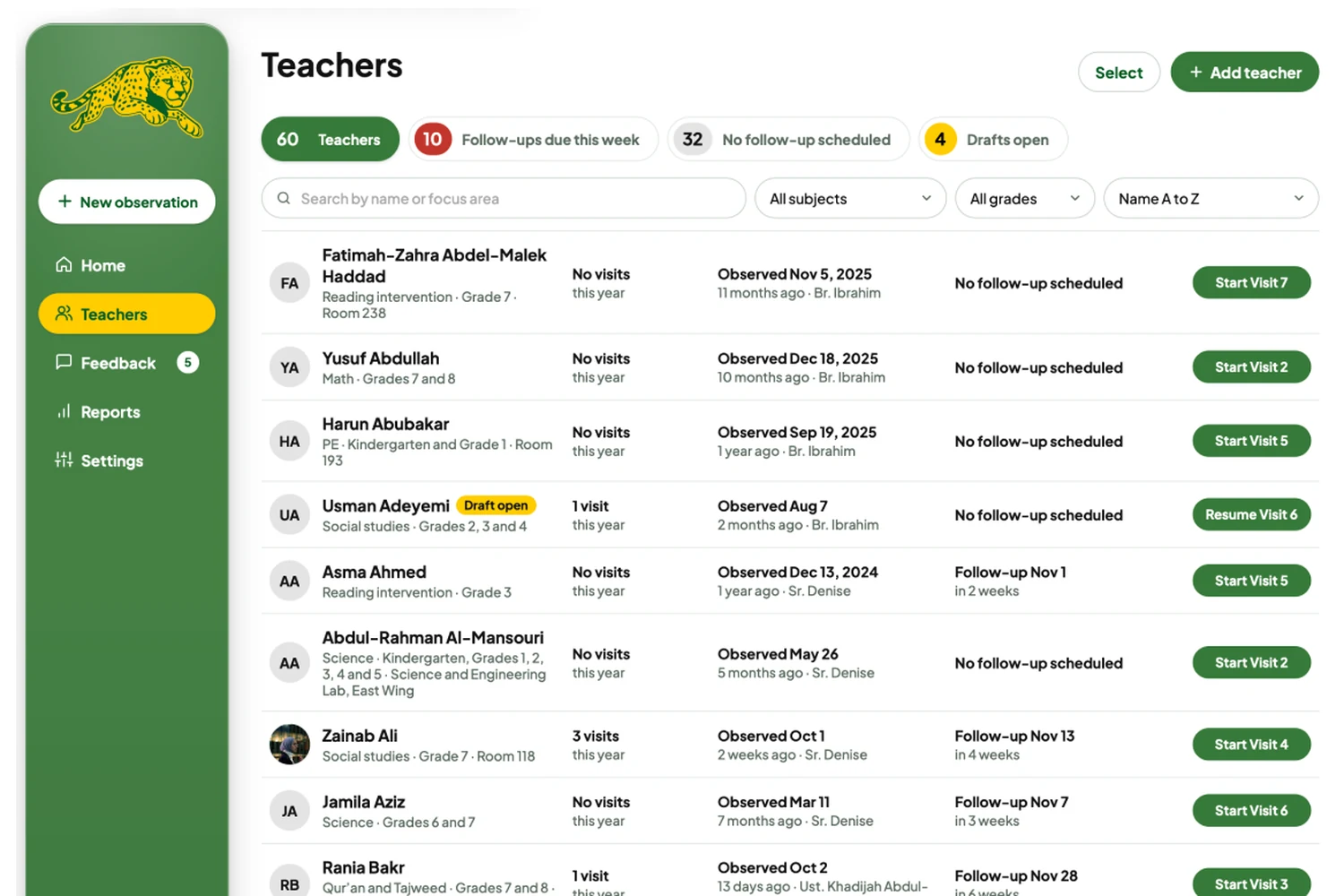
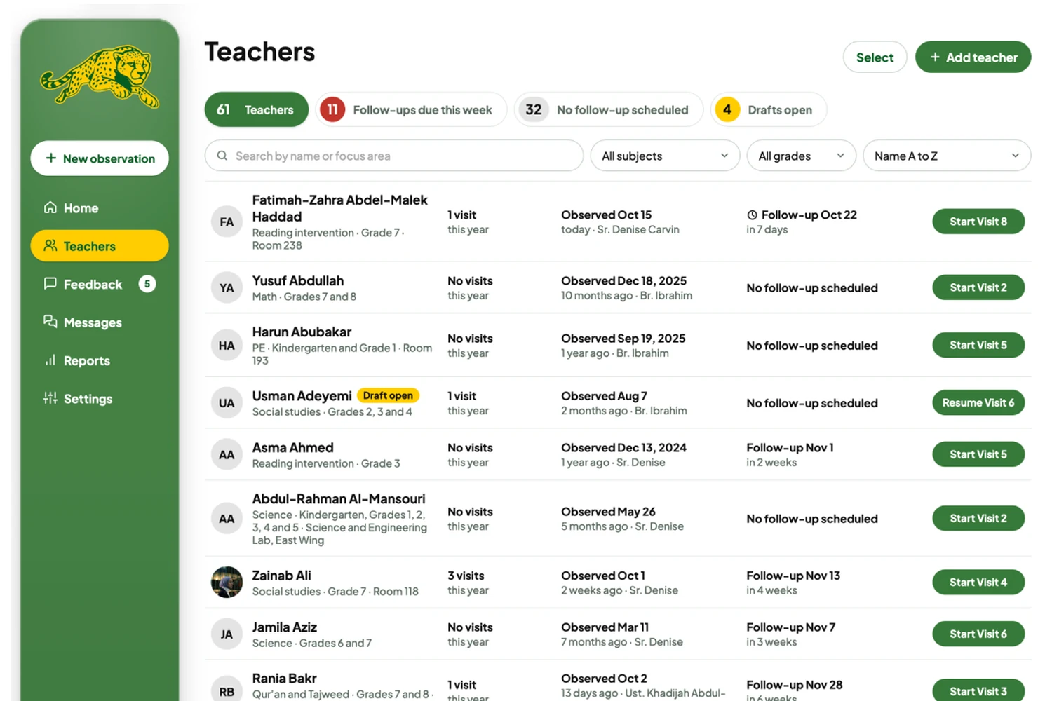
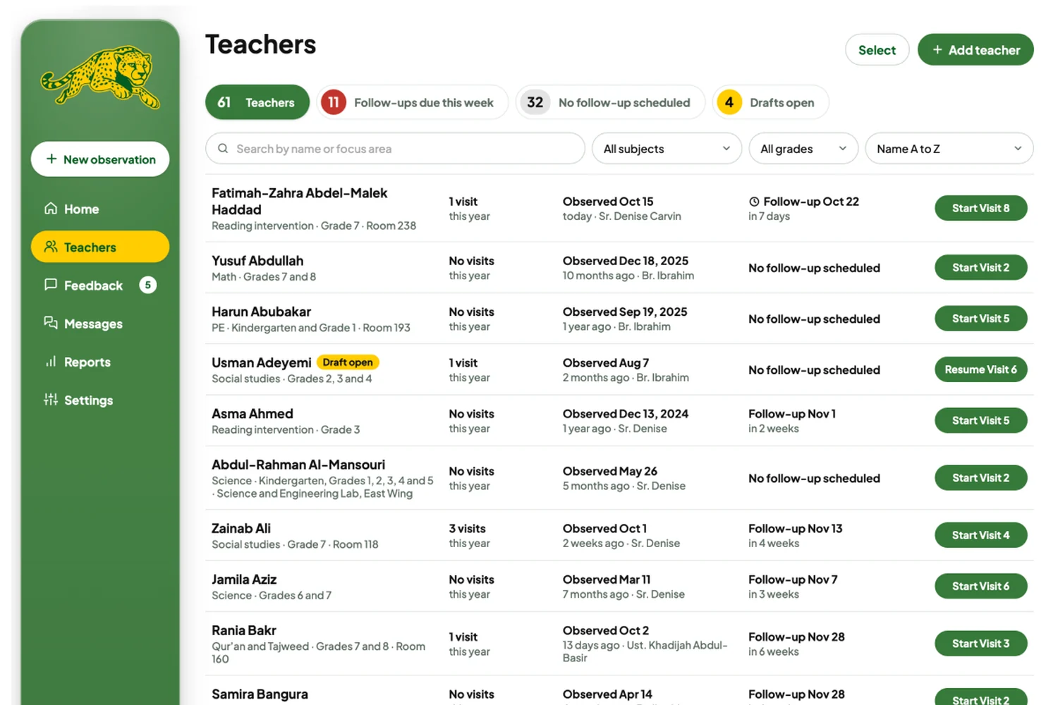
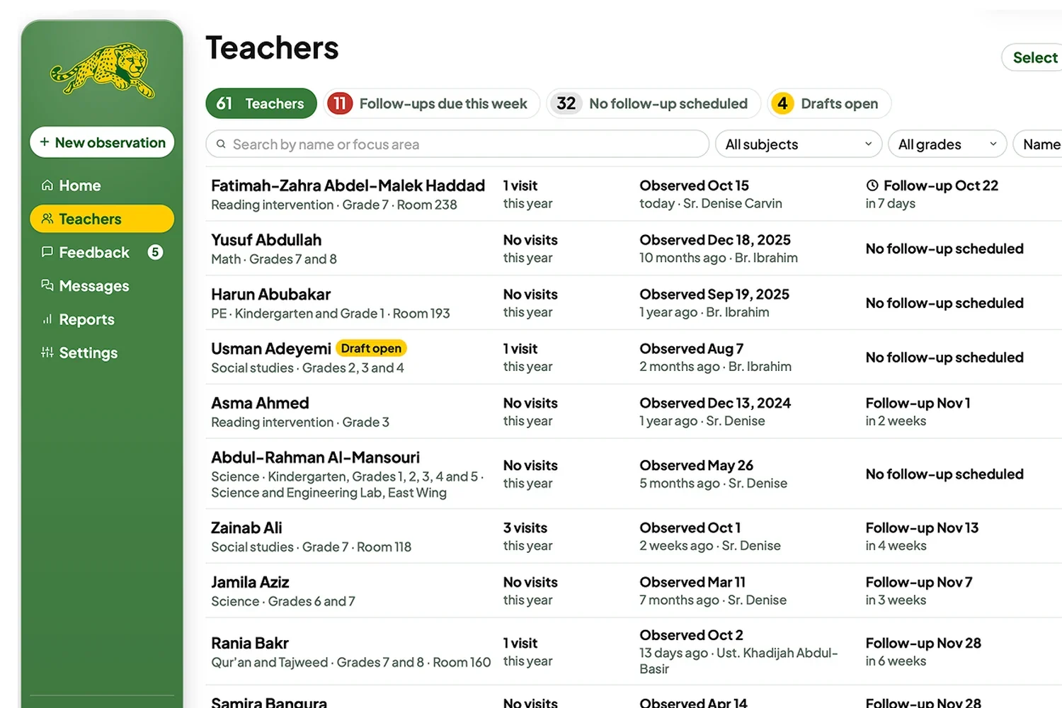
Across testing, the Teachers screen went through four versions.

V1

The first colored, low-fidelity version, made in Figma.

  • Gave testers a much better idea of what to expect.
  • “I like the green, yellow, and red at the top, keep that.”
  • Another tester found it “worrying to see all that red.”

The first official dry run had an 89% success rate.

My goal was above 70%. I had been sharing wireframes and earlier iterations in the admin group chat along the way, so the design was very informed. The admins who tested it had a blank slate. None of them had seen the wireframes.

89%

Success Rate

on the first dry run, past my goal of 70%.

60

Sample Teachers

loaded in, some with drafts and some overdue for feedback.

6

Tasks

tested one on one with 3 admins.

How the 3 admins did

  • Every admin started an observation.
  • Every admin delivered feedback in under 7 minutes.
  • Every admin added a teacher in under 5 minutes.
  • Only 1 found how to edit a teacher, so I moved Edit next to their name.
  • Every admin found the results in under 3 clicks.
  • Every admin printed the .pdf with no errors.
07.

Results

What the admins said, in their own words.

“Now we need to redo all of RSA’s tools. You are so detail-oriented.”
Iman K • Middle–High School Principal Iman K Middle–High School Principal
“I love this. I love the messages and the admin-only note, those are my favorite.”
Denise C • Elementary Principal Denise C Elementary Principal

What’s next

A Resend email account, so feedback emails send themselves, and a server, so admins and teachers can actually log in.

next project Ozempic Supply Chain Take a look at this project where I researched the Ozempic supply chain and how UX can improve it.