care is connected
Doctor Notes
secure visit sharing for your care network
Doctor Notes turns doctor visits into AI summaries, but there was no way to share them. I co-designed a secure, in-app sharing circle from scratch.
care is connected
secure visit sharing for your care network
Doctor Notes turns doctor visits into AI summaries, but there was no way to share them. I co-designed a secure, in-app sharing circle from scratch.
I worked with Khaleed Alston Khaleed Alston • Founder & CEO
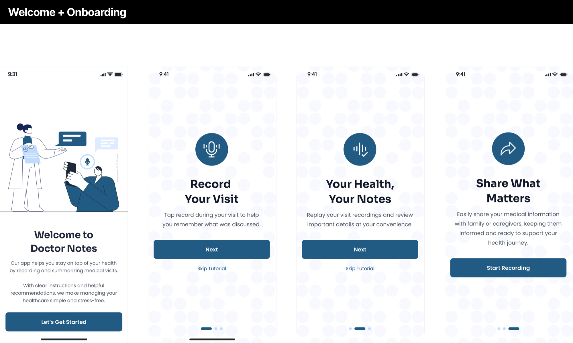
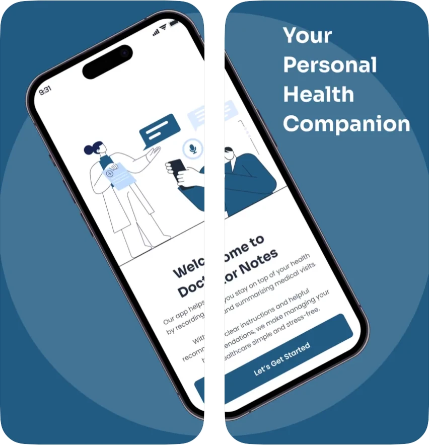
Khaleed is the founder and CEO of Doctor Notes. While testing the first version of the app (then called NuriQ), he and his team wanted to add a way to share visit summaries with family and caregivers, but couldn’t figure out how to make it work. What we came up with became the sharing circle.
Our first problem: the three main stakeholders had very different ideas of how sharing should work.
As one of two UX/UI designers, my job was to bring the stakeholders’ ideas together into one design.
Khaleed Alston founder & CEO
Julie Atwood stakeholder
Brett Atwood stakeholder
How we resolved it
Three buttons, not four
We kept the bottom nav to Visits, Record, and Profile, so the app stays simple for everyone, especially older users.
Kept Khaleed’s simplicity for older users, without Julie’s empty button.
Tabs instead of dropdowns
My Visits and Shared with me sit as tabs at the top of one page. Your own visits never get buried, and there’s no empty button if you never share.
Gave Julie her one page, without the clutter Brett worried about.
A screen for every sharing path
We designed flows for when the person you share with has the app, doesn’t have it, or needs to download it, plus stopping sharing and seeing what’s new.
Answered Brett’s deep links, Julie’s stop-sharing worry, and Khaleed’s push to get people on the app.
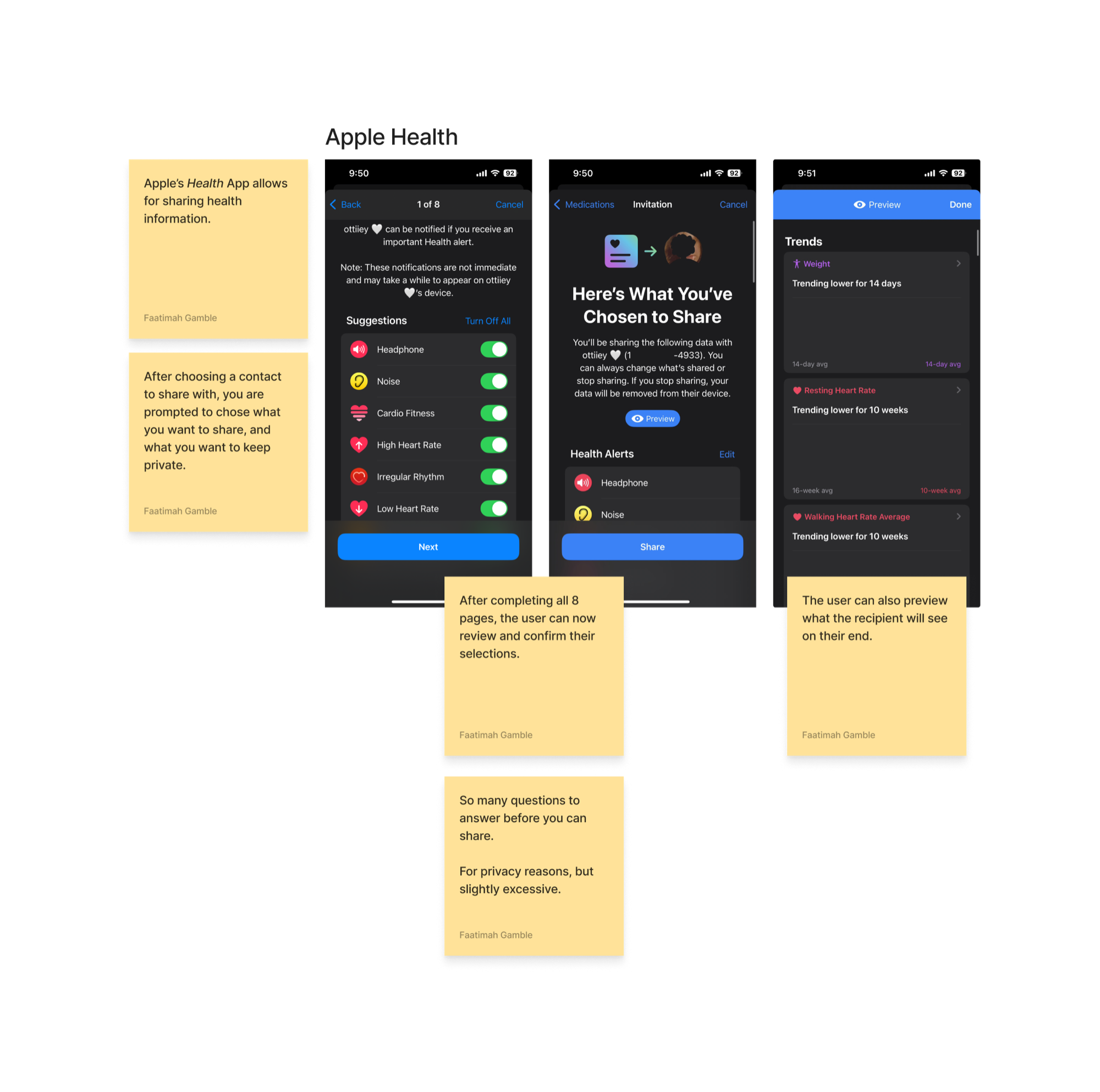
Sharing didn’t exist yet, so we built it from scratch, starting with how other health apps get it right.
I studied how existing apps handle secure health-data sharing, from Apple Health to other tracking apps, mapping what earned trust and where sharing got clunky.
I sketched two sharing paths on paper, one for a recipient who already has the app, and one for a recipient who doesn’t, so the flow was resolved before any pixels.
I refined the flows into high-fidelity screens covering every sharing and un-sharing path, then handed them off to the app developers in enough detail to build the feature and test it in TestFlight.
The sharing circle shipped in Doctor Notes 2.0, the app’s next big public update.
Click any board to see it larger
The sharing circle is live on the App Store in Doctor Notes 2.0.
All three stakeholders approved the final design, and it shipped as-is, with no revisions after the build.
High-Fidelity Screens
designed and handed off to the developers, covering every sharing and un-sharing path.
Sharing Scenarios
addressed, from sharing with someone who already has the app to someone who needs to download it.
Stakeholders
with very different ideas, brought together into one simple design.
Khaleed, the founder, introducing Doctor Notes (then called NuriQ) and the sharing circle.
I’m Khaleed. I’m the founder of NuriQ and I’m also a physician. I’m a father. I’m a husband. And I helped my mother through her diagnosis of breast cancer. It’s for that reason that I know what it’s like to be on both sides of the exam room. Too often, people and families leave their doctor’s office confused, overwhelmed, and unsure what to do next. The truth is, healthcare was not designed for the patients. And for that reason, it doesn’t give you clarity, confidence or connection. And that is why I created NuriQ. NuriQ is an AI-powered platform that is designed specifically to help simplify medical information. You as a patient are able to walk into a medical visit and press record on your phone and without any intervention from the doctor, you’re able to walk away with a clear, concise summary that helps you understand what to do next, and share with friends and family who are invested in your healthcare journey. We are uniquely positioned to support a multilingual, diverse market, one that has an over $80 billion market cap that is only growing. Our diverse and talented team has built a real product, one that we have tested in real clinics with real patients. This is the product that I wish I had for my mother when she was sick. NuriQ is going to change the healthcare landscape. So join us as we reimagine the future of healthcare.